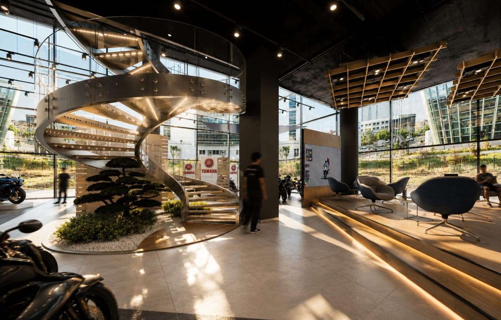
A dealership is not simply where the product is displayed; it is an operation where sales, service, storage and management share one roof. Through the Yamaha Premium Dealer complex, we examine the seven decisions that let those three functions coexist in a single building without obstructing one another.
From the outside, an automotive dealership looks like a shop with a very large window. From the inside it is three quite different businesses sharing one building: sales wants quiet and light, service generates noise and dirt, and the back office expects uninterrupted concentration. When those three are not properly separated, the result is familiar: the customer signs a contract under the sound of a compressor, and a technician crosses the middle of the showroom to fetch a part.
The multi-storey Yamaha Premium Dealer showroom and service complex, designed by our team in Ankara, was built precisely around resolving these three functions in one building. The seven decisions below are the ones worth putting on the table at the first meeting of any dealership project, whatever the brand.
1. Three functions, three levels: dirty work stays below
The most fundamental division in a dealership is clean versus dirty. Oil, compressor noise, parts deliveries and vehicle movement must be physically severed from the area where the customer is alone with the product. That separation lasts when it is made not with a curtain or a partition wall but with a change of level.
In the Yamaha complex, service and hardware operations went to the lower floor, the main showroom experience to the ground floor, and offices and social areas to the upper floor. The service vehicle entrance therefore never crosses the customer entrance at any point, and parts delivery is resolved on its own level. This is also an acoustic decision: there is a floor slab between the noise source and the sales conversation. We covered the technical side of that in our article on sound insulation in interiors.
2. Vertical circulation is the spine of the brand
Distributing functions across floors creates a new problem: the building fragments. Customers stay on the ground floor and the upper level turns into dead space. The answer is to design the stair not as an obligation but as an invitation.
At Yamaha, the centre of vertical circulation is a steel spiral stair set against the glass façade with lit treads, and beneath it a small interior garden of gravel and bonsai. The stair stops being a circulation element and becomes the focal object of the showroom — going upstairs is no longer a task but a continuation of the experience.
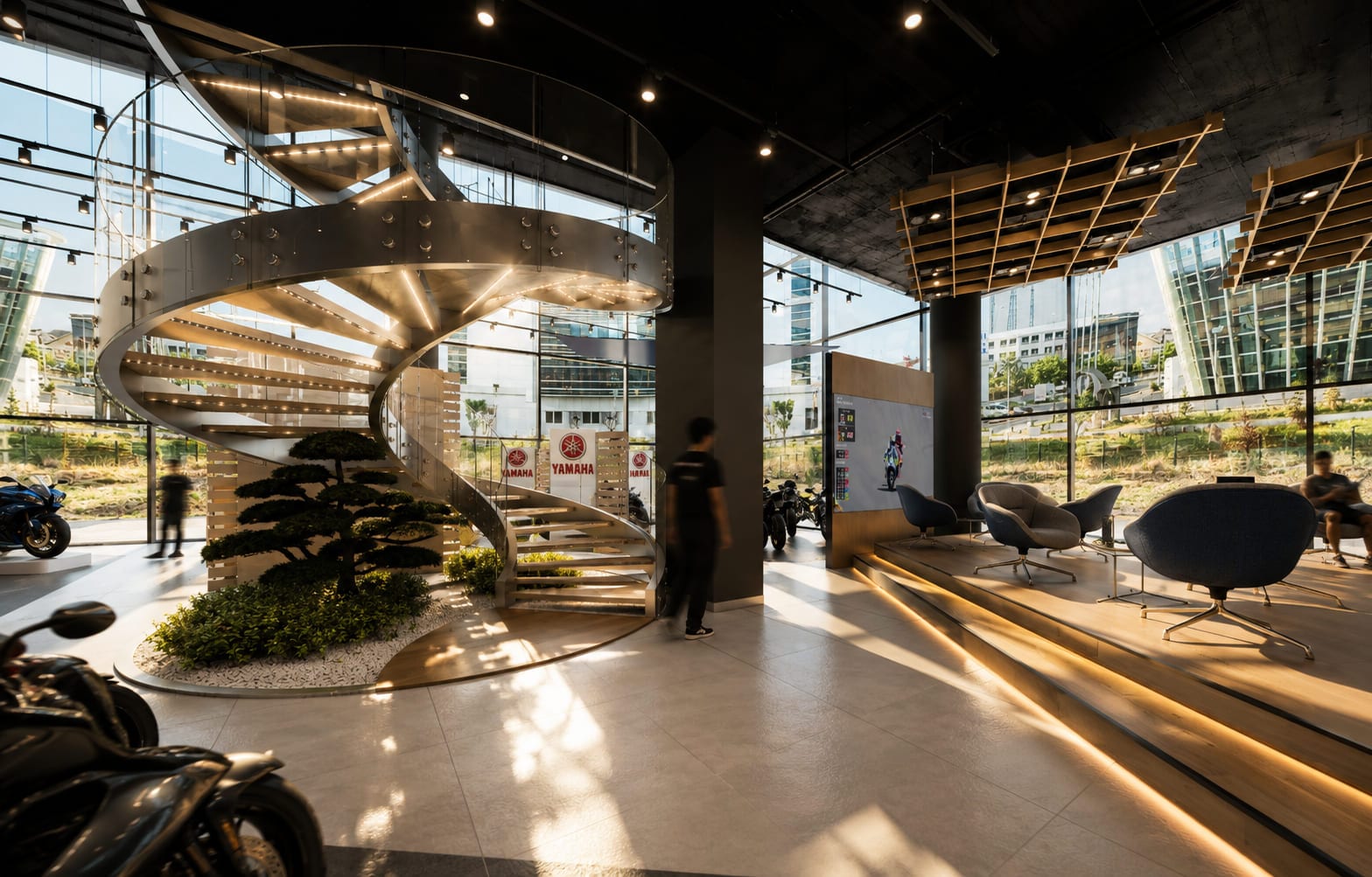
The spiral stair ties three floors together; the garden beneath lifts it out of circulation and into the focus of the showroom.
3. A showroom is a zoning problem, not a window display
Lining products up is not display. Customers come to a showroom "to have a look", and often do not know precisely what they are after. A good showroom converts that uncertainty into legible zones: areas divided by use case, each readable from a distance by its own signage.
At Yamaha the product family was split into sections, and each section received its own signage, its own backdrop panel and its own lighting setting — the racing side with a navy backdrop and a large image, the everyday side with a more neutral composition. A customer walking in understands where to head without asking, and the sales advisor starts the conversation from a point beyond "what are you looking for?".
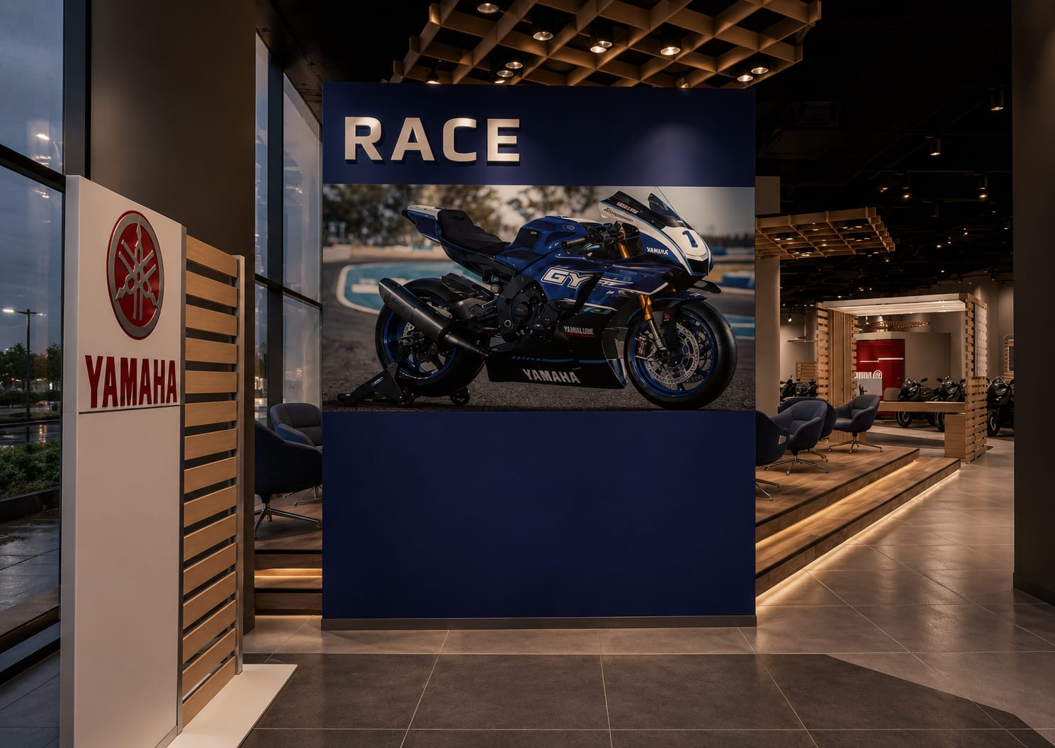
Every product family gets its own section, signage and backdrop panel; wayfinding no longer requires staff.
4. Products are displayed like sculpture: plinth, base and backdrop
Three elements govern the display of an expensive product: height, light and backdrop. A product standing on the floor is furniture; lifted onto a plinth, lit from above and below, with a calm texture behind it, it becomes an object.
At Yamaha the products were raised onto plinths and bespoke bases, with timber lath wall panels used as the backdrop. A slatted surface does two jobs at once: it sets a neutral yet textured background, and it produces depth with light concealed behind it. Spots recessed into the timber coffered ceiling grid wash the product from above. The result is that the display area reads as a stage rather than a shop window.
5. Service is not hidden — it is put on show
The reflex is to hide service behind a door. Yet the customer's greatest anxiety sits exactly there: who will work on my vehicle, where, and how? Invisible service amplifies that anxiety, whereas orderly, visible service is the most powerful instrument of trust.
In the Yamaha complex the service floor was not concealed but designed: numbered service points, a lit reception counter, orderly tool panels on the wall, a transparent storage system and clearly drawn circulation lines on the floor. The exposed mechanical ceiling and linear lighting own the industrial character rather than disguising it. The wash bay, meanwhile, looks out through a glazed band — the process becomes something you can watch.
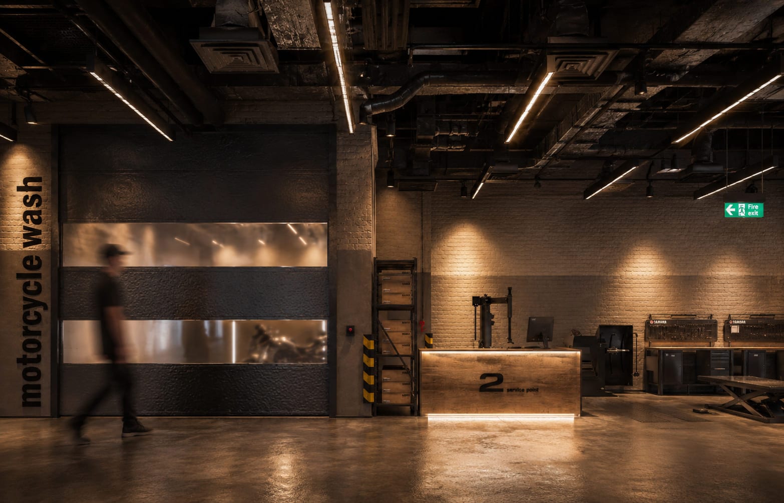
The service floor is not hidden: numbered bays, a lit counter and an orderly tool wall keep the process observable.
6. The accessory wall turns into a collection on a single panel
Accessories and spare parts are the most profitable yet most neglected line in dealership turnover. Scattered across shelves, customers read them as individual items. Gathered onto one large panel in a matrix layout, the same products create the perception of a collection — and a collection asks to be completed.
At Yamaha the helmet, apparel and parts group was gathered into a single wall composition. This may look like an architectural preference, but it directly affects cross-selling: a customer buying the product reads the accessory, part of the same visual language, as a continuation of the brand. We covered display principles on the retail side separately in our article on shop and showroom interior design.
7. The back office is part of the brand experience too
In dealership projects the budget usually goes to the area the customer sees, and offices and staff areas become "whatever is left". Yet the sales team spends eight hours a day there, and it is that team which represents the brand. The customer also ends up on that floor at the contract stage.
At Yamaha the management office on the upper floor was laid out as an open plan: a corporate navy accent wall, circular niches set into a timber slatted surface, acoustic desk panels, a metal mesh ceiling island and large circular pendants. The staff canteen carries the same brand language in an everyday register — a neon brand sign, long timber tables and leather banquette seating.
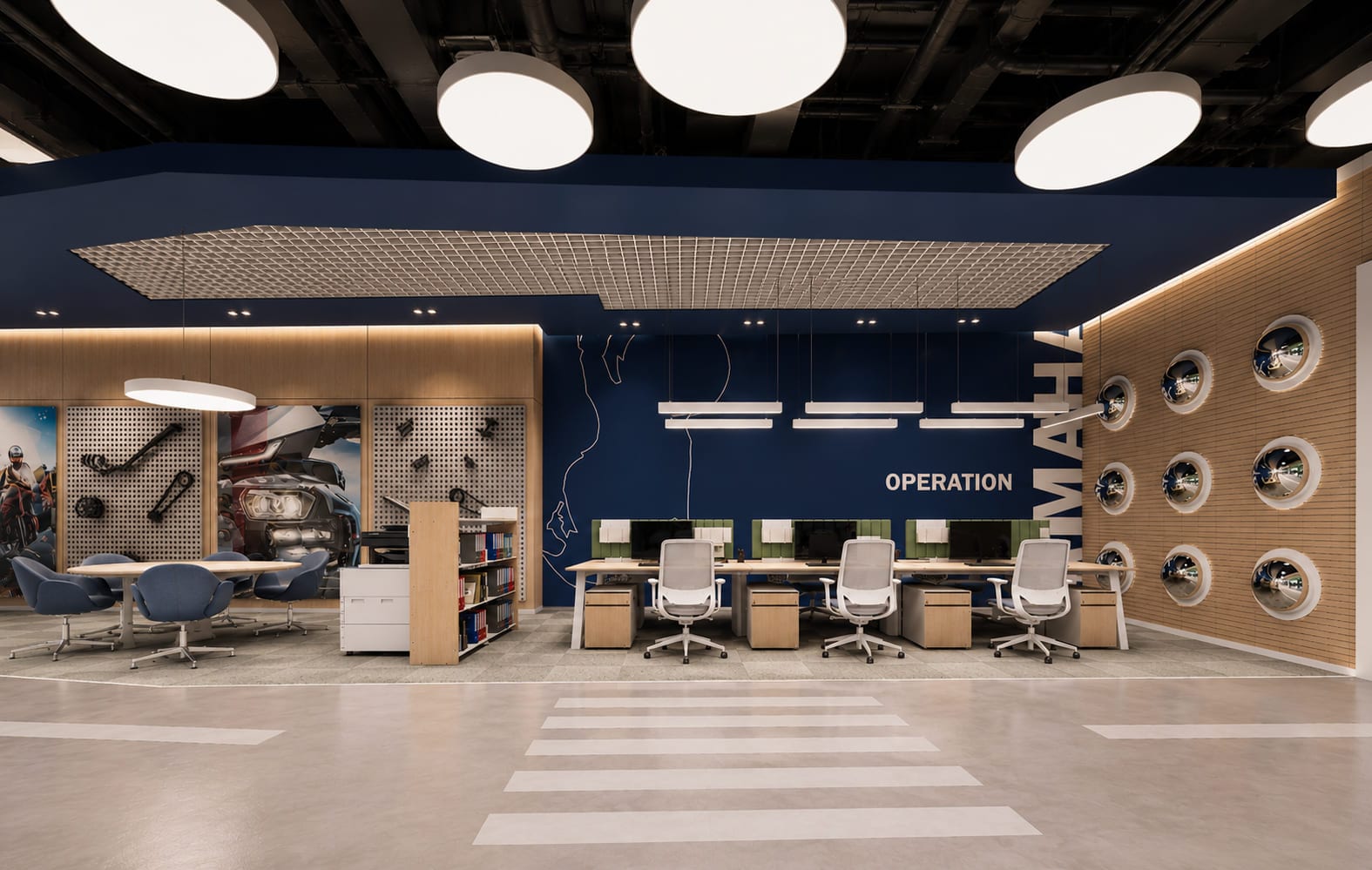
The upper-floor office: the brand language continues into the back office, and acoustic panels keep the open plan workable.
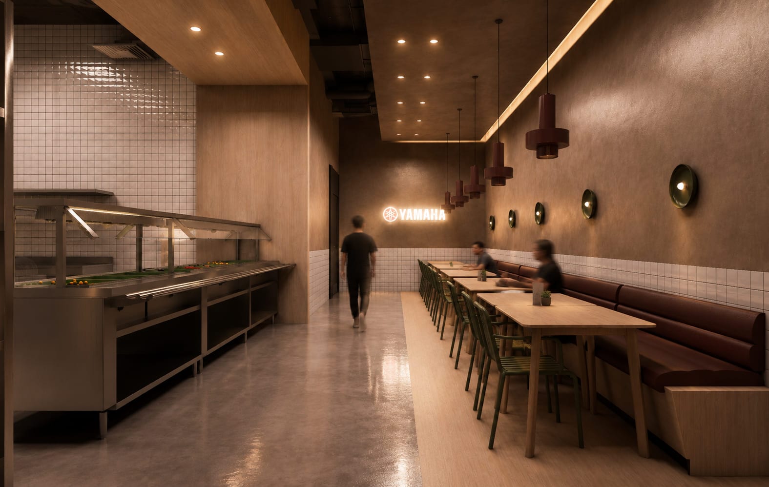
The staff canteen carries the same identity in an everyday tone; brand experience does not stop behind the door.
Frequently Asked Questions
Can showroom and service sit on the same floor in a dealership?
They can, but the separation must then be built with distance, level changes and acoustic measures. The decisive criterion is that the service vehicle route and parts delivery never cross customer circulation at any point.
What lighting setup is right for a showroom?
A single uniform layer of general light flattens the product. General lighting, accent light aimed at the product, and indirect light concealed within backdrops and plinths should sit on separate circuits, so that day and evening give two different atmospheres.
How much corporate identity should appear in the space?
The corporate colour works as an accent, not as a ground. Over a neutral, industrial base palette (concrete, steel, timber), using the brand colour on selected surfaces keeps the identity legible without making the space tiring.
Isn't opening the service area to customers a risk?
Visibility and access are not the same thing. The process should be observable through glass or along a controlled line, but the customer should never physically enter the working area. Defined safe circulation lines on the floor establish that distinction.
What is the most common mistake in dealership architecture?
Starting the project from the display area. The correct order is the reverse: service, storage and delivery logistics are resolved first, and the showroom is composed where that flow allows. Otherwise the operation ends up breaking the design later.
Explore the Yamaha Premium Dealer project
You can see the complex's service floor, main showroom, accessory wall, management office and social areas together with a gallery of 53 images on the Yamaha Premium Dealer showroom project page. If you are planning a display or retail space, explore our Ankara showroom design, Ankara shop design and İzmir shop design pages, and get in touch with us to discuss the scope.
Project and text: Kaan Yalçınkaya, Kaya + Partners. Yamaha Premium Dealer; multi-storey showroom, service and office complex, 2024–2025.