A holistic interior architecture project for a new branch of a patisserie-café brand on Ankara's Çayyolu–İncek corridor, uniting the façade, outdoor terrace and interior under a single identity. Zahire 1938 Rota Kafe translates the brand's memory, reaching back to 1938, not into an imitation of nostalgic décor but into a timeless material language: a curved stone portal, arched service niches and a chequered display line. Kaya + Partners built the project around a single question — what does a guest see from the moment they step through the door until they sit down at their table?
A Meeting Point on the Çayyolu–İncek Axis
The space sits at the intersection of the residential and office density between Çayyolu and İncek. The two districts have different rhythms: the Çayyolu side is daytime and family-oriented, the İncek side leans towards evenings and weekends. The terrace, main hall and service band were therefore resolved so they can operate independently of one another — the morning coffee and takeaway line comes to the fore, while the hall and terrace take over in the evening.
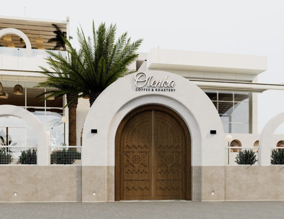
Façade — A Brand Doorway Framed by a Curved Stone Portal
The shopfront on the high-street axis is framed by a cream stone-clad portal with softened corners. The gold ZAHİRE 1938 signage on a dark brown ground repeats along the façade as an uninterrupted band; the brand name reads from a distance and, as you approach, reappears embossed into the portal's stone.
The bronze metal door at the entrance, with its circular motif, is the project's signature detail: solid as a chest lid when closed, a filter carrying the display lighting out to the street when open. In the café façade design, the aim was not to compete with the other shopfronts along the same parade, but to establish a different kind of quiet.
Garden Terrace — The First Contact with the Street
The terrace running the length of the façade is separated from the pavement by low green borders and a planter. Scallop-edged cream parasols, woven armchairs and spherical light fittings lift the terrace out of being a zone of "tables left outside" and turn it into the venue's most visible salon.
The perforated concrete screen wall filters the sun while shielding those seated from the foot traffic of the parade. In Çayyolu café design, shade, privacy and visibility must all be resolved at once — here, a single wall does it.
Patisserie Display — The Service Band Where the Product Takes the Stage
The spine of the interior is the display and service band running uninterrupted from the entrance to the till. The display cases are aligned parallel to the guest's walking line; the product sits under warm light, while the back wall is composed as a dark backdrop. Cakes, chocolates and bakery goods thus become the sole element that sets the colour of the space.
- Sections separated by illuminated capsule signs: ice cream, desserts, savouries, till and collection
- Refrigerated cake display cases with curved ends and warm lighting
- An island counter and till line for standing service
- A chequer-patterned ceramic-clad back panel and arched niches
- A stage backdrop closing with the gold ZAHİRE 1938 wall logo
Arched Niches and Chequered Texture — A Timeless Language
The round arched niches repeating along the service band are a contemporary reading of a classic bakery typology. The beige-and-brown chequer pattern takes the place of faux-marble surfaces, lending the space a historical resonance without copying any single period outright.
This pairing — arch and chequer — reappears in every layer of the project: on the display panel, in the niches, across the wall cladding. Repetition is the cheapest and most enduring instrument of identity in brand café concept design.
Coffee Bar and Kitchen Line — The Visible Face of the Operation
The coffee bar is resolved as an independent island beneath the menu boards; the espresso line, hot drinks and takeaway are gathered at the same counter. The open kitchen window shows the guest the point where hot products emerge — unlike a closed back kitchen, preparation here is part of the atmosphere of the space.
Staff circulation and guest circulation are separated into two parallel lines; they intersect only at the till and collection point. In horeca interior design, this matters as much as aesthetics: a plan that saves seconds, not square metres.
Dining Halls — Glazed Façade, Natural Light and a Green Wall
The seating halls behind the service band are resolved with full-height glazed façades. The timber-panelled ceiling and the concealed light band running around its perimeter bring the high-ceilinged volume back to human scale; by day natural light carries the space, in the evening this band does.
- Rounded seating groups upholstered in green and cream velvet
- A continuous banquette and tables for two running along the window line
- A fine brick-textured wall punctuated by oval mirrors
- An illuminated ZAHİRE wall framed by tropical planting — the venue's photo corner
Material and Lighting — A Warm Neutral Palette
The palette is reduced to four materials: cream stone, dark brown timber, bronze metal and beige ceramic. Colour is the business of the product and the planting; the architecture serves as their backdrop. The lighting is composed with the same discipline — focused warm light at the display, soft spheres and a concealed band in the hall, illuminated signage along the service band.
A Café Concept Repeatable at Chain Scale
Zahire Rota Kafe was designed not to beautify a single branch but to establish a replicable identity. The portal, the arch, the chequer pattern and the illuminated section signs form a grammar that can be reconstructed across different floor areas. Café interior architecture in İncek and Çayyolu means building today the face by which the brand will still be recognised a decade from now — and that is precisely what this project sets out to do.